
Yale Medicine
Website redesign

overview
Yale Medicine specializes in cutting-edge technology and multidisciplinary approaches that deliver exceptional medical care in a nurturing environment to every patient, every day. They are the largest academic multi-specialty practice in New England and their patients receive care from some of the world’s most renowned doctors.
Challenge: Redesign Yale Medicine’s website across all platforms in order to create a better user experience for both patients and specialists.
My Role
User flows, Heuristic Evaluation, Information Architecture, Sketching, Iconography, Wire-framing, UI, Prototyping, Lo/Hi Fidelity Designs, Usability Testing, Motion Graphics
Client
Yale University
Timeline
6 months
Our process
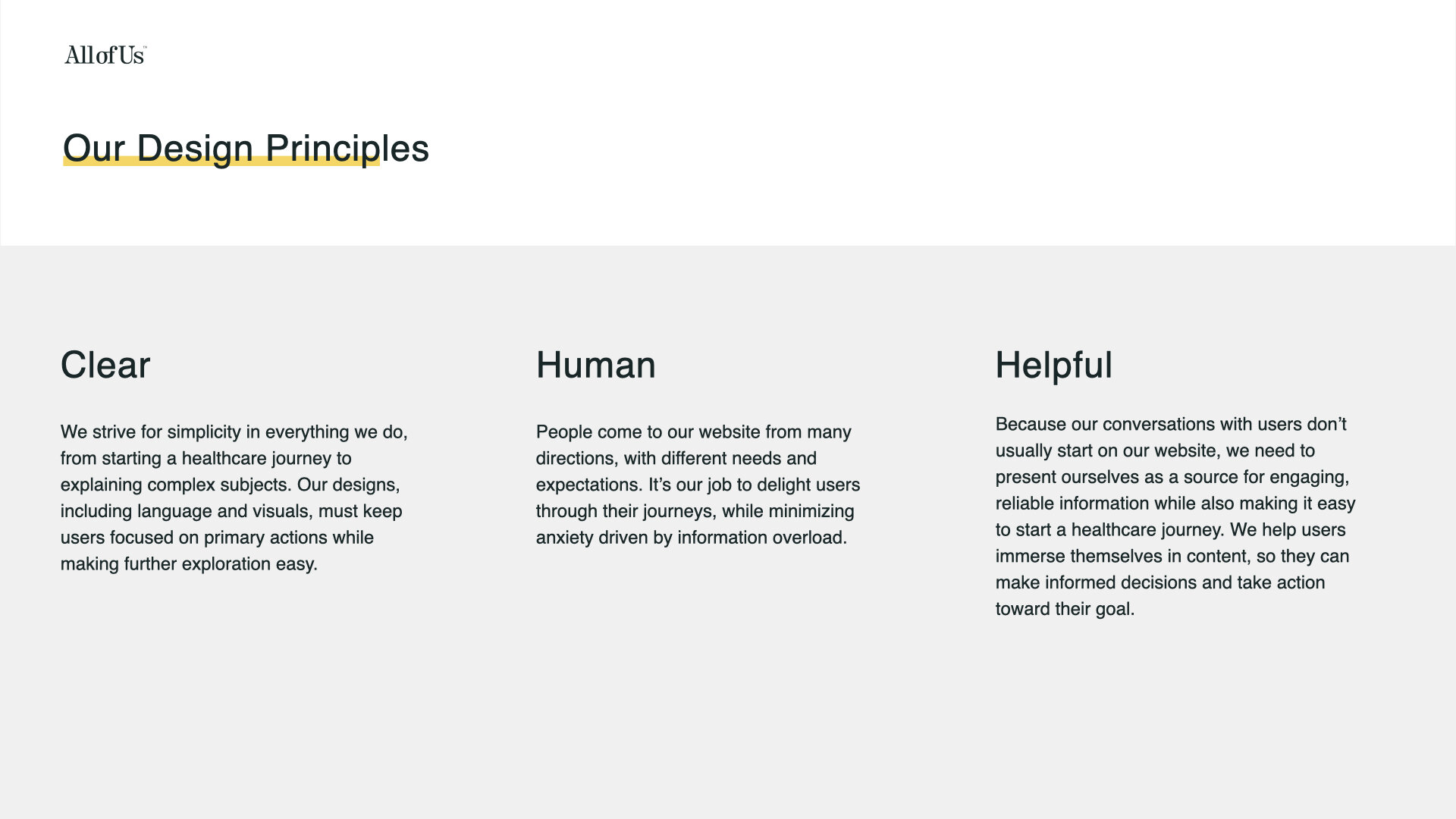
Designing for the User First
We included our client and users in every step of the process. Our project scope accounted for 2 months of feedback & iteration so that we could ensure a better experience for everyone.

Business Goals
DRIVE. SUPPORT. INCREASE
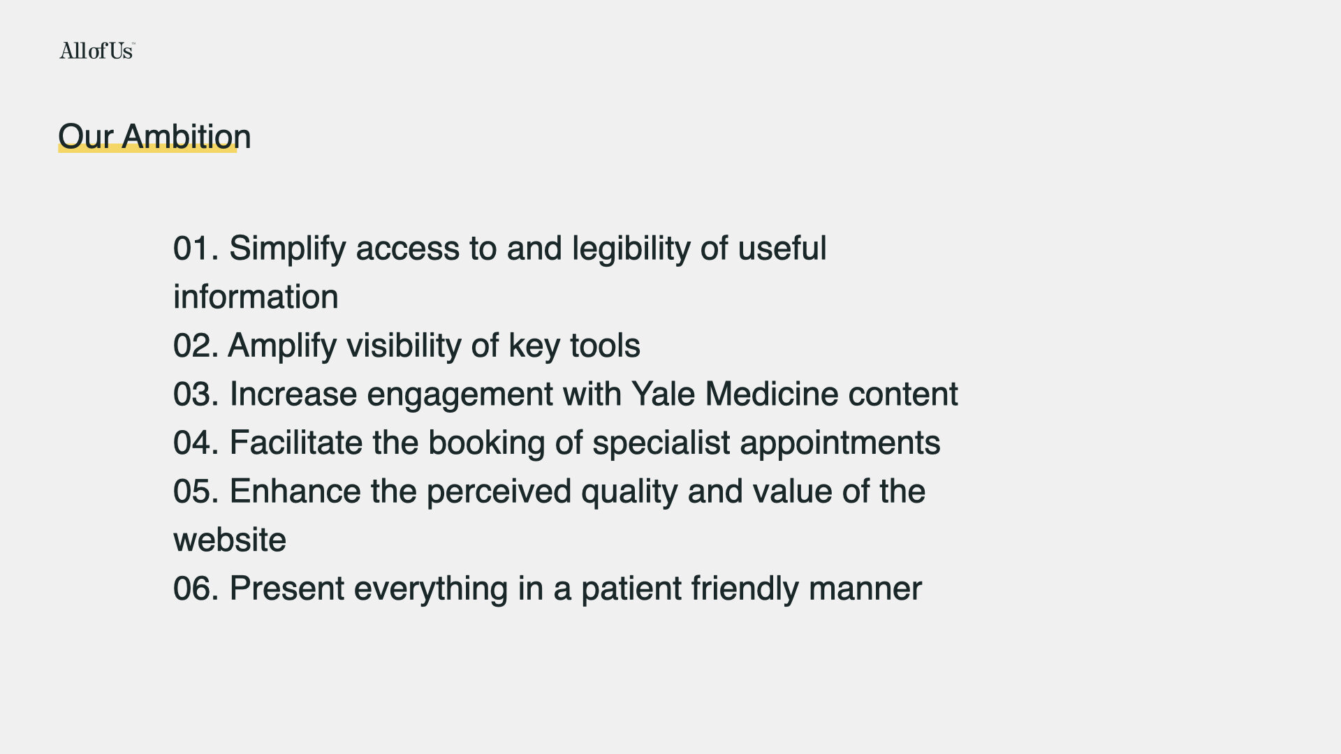
Use digital technologies to better connect patients with clinical specialists to best support their needs within the most cost effective framework. Drive appointments with clinical specialists by using a fully connected and analytically quantified link between Specialist capacity, content marketing and appointment booking.
User Interviews
Let’s Meet The Users
We interviewed 5 doctors and 15 patients/caregivers at Yale University. Our main testing areas for both patient and doctor were:
How do users learn about a specific medical condition?
How do users find the right specialist doctor?
Findings
Learning About a Medical Condition
Most users turned to a generic internet search on Google. Almost all participants name-checked WebMD or Mayo Clinic as trusted sources that they end up on, with a small percentage asking friends and family.
If participants could find valuable condition content on Yale, they immediately added it to their mental list of trusted sources but no one thinks to start there and visibility in Google is very poor.
Finding the Right Specialists & Doctors
The vast majority of the participants reported being referred to a Specialist by their PCP and only infrequently looked for one directly.
Those who did find one often took that name to their PCP first.
More participants have researched a specialist after they have had one recommended and often look for reviews and some background information.
Personas
Making Educated Assumptions from our Findings
SCIO Health Analytics have defined 7 key types of patients within the US built around, behaviors and attitudes, demographics, clinical factors, cost and quality of care and utilization rates. From this set we can make certain assumptions around behavior to outline personas.
Broadly speaking we believe there are three different behavioral patient personas which the website will cater towards.

Personas
User Journey
Supporting Patients
Providing the right content and tools to patients at the right time will ensure that their interaction with Yale Medicine requires the minimum Customer Effort for the greatest customer value. We have identified four different possible stages of patient interaction which all patient journeys should consider.

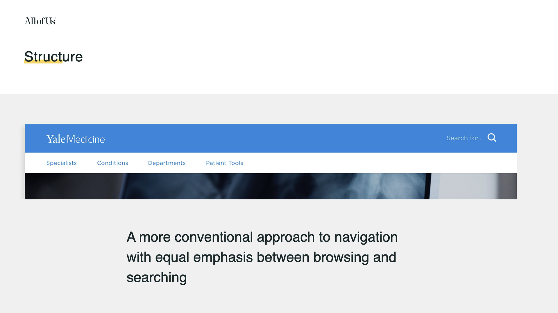
Current Website
Page Level Feedback
We took the users through each page to get a better understanding of how each element resonated. We used a grading system to show where users experienced positive reactions, mixed reactions and/or pain points.
User Work shop
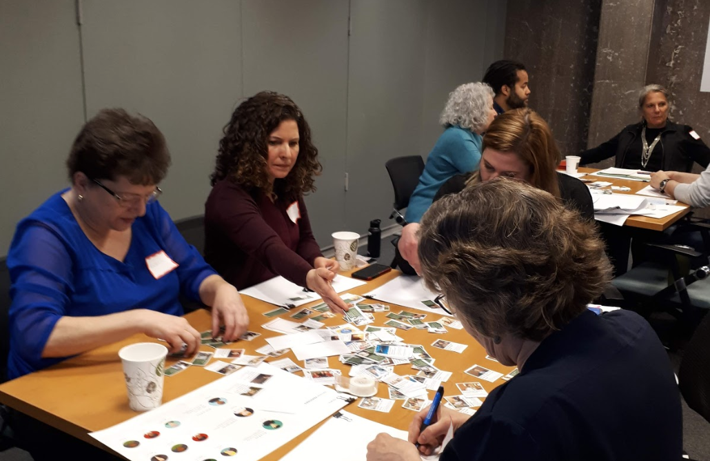
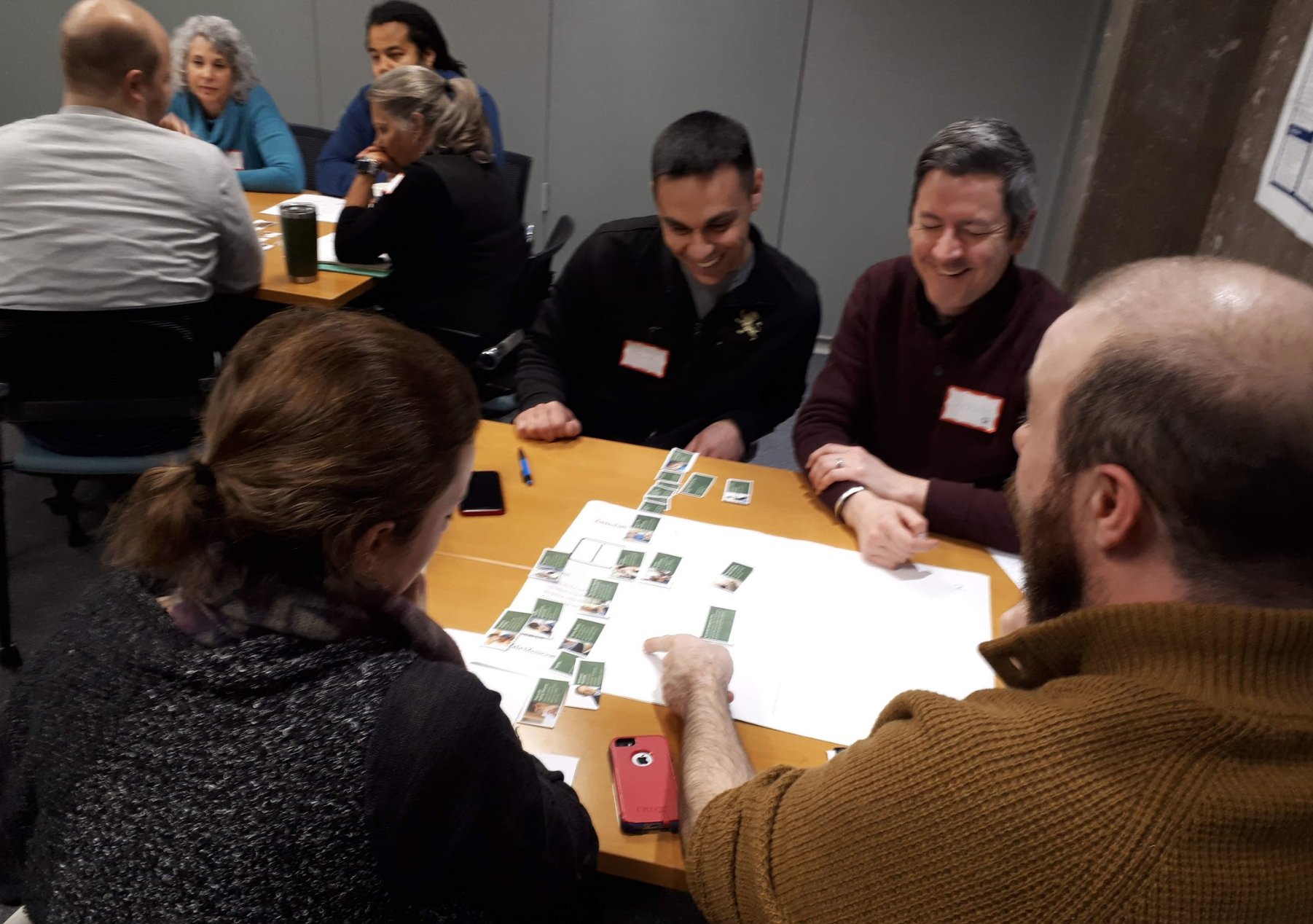
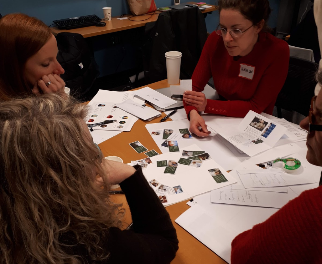
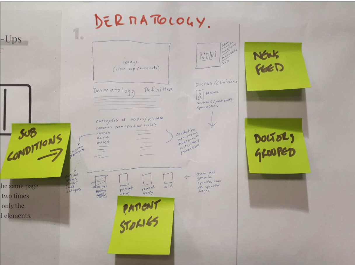
Topic Mapping & Content Modeling
Before sketching wire frames, we wanted to categorize all the potential features and content on the website. So, we held multiple workshops with users that were familiar & unfamiliar with the current site. We put them into small groups and tasked them with cutting up, drawing & organizing given content and topics. This process was useful in:
Understanding what types of content you have
Analyzing how the content is made up
Defining how the content relates to each other
Understanding how users conceptualize & organize content
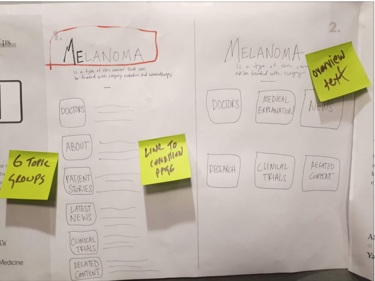
Information Architecture
Restructuring & Reorganizing
With the qualitative and quantitative data from the users, we were able to start reorganizing content. Once we had a better understanding of the content as a whole, it was clear how the IA would be structured.

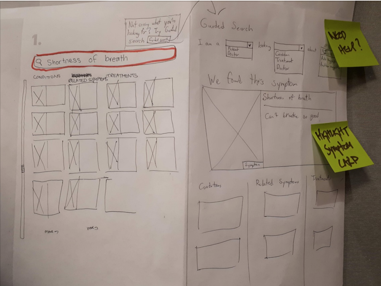
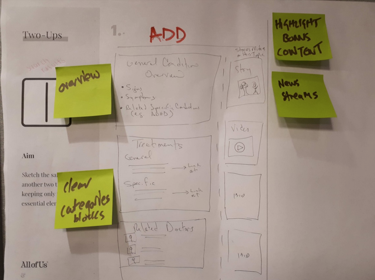
Wireframes
Finding the easiest path for our users
Thanks to the results of the topic mapping & content modeling workshops, it was easy to organize and design the first round of wire frames. We found that users do NOT all think the same way but, they seemed to all use the same language. So, I was tasked with organizing and reassembling their ideas in a way that everyone could understand.

Iteration
Time to see what the client thinks
Throughout the 6 month project we held weekly meetings with our client so that we could show them our progress and get constant feedback. Until now, the client hadn’t seen any designs and they were very excited to see what we had developed. In order to receive as much feedback as possible, we uploaded the wireframes to Invision and held a workshop teaching users how to leave helpful comments.
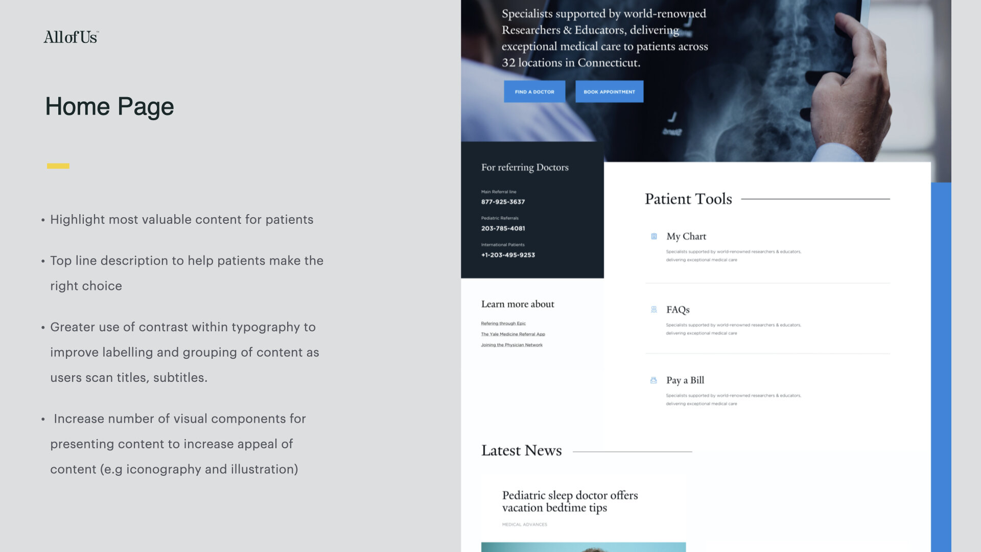
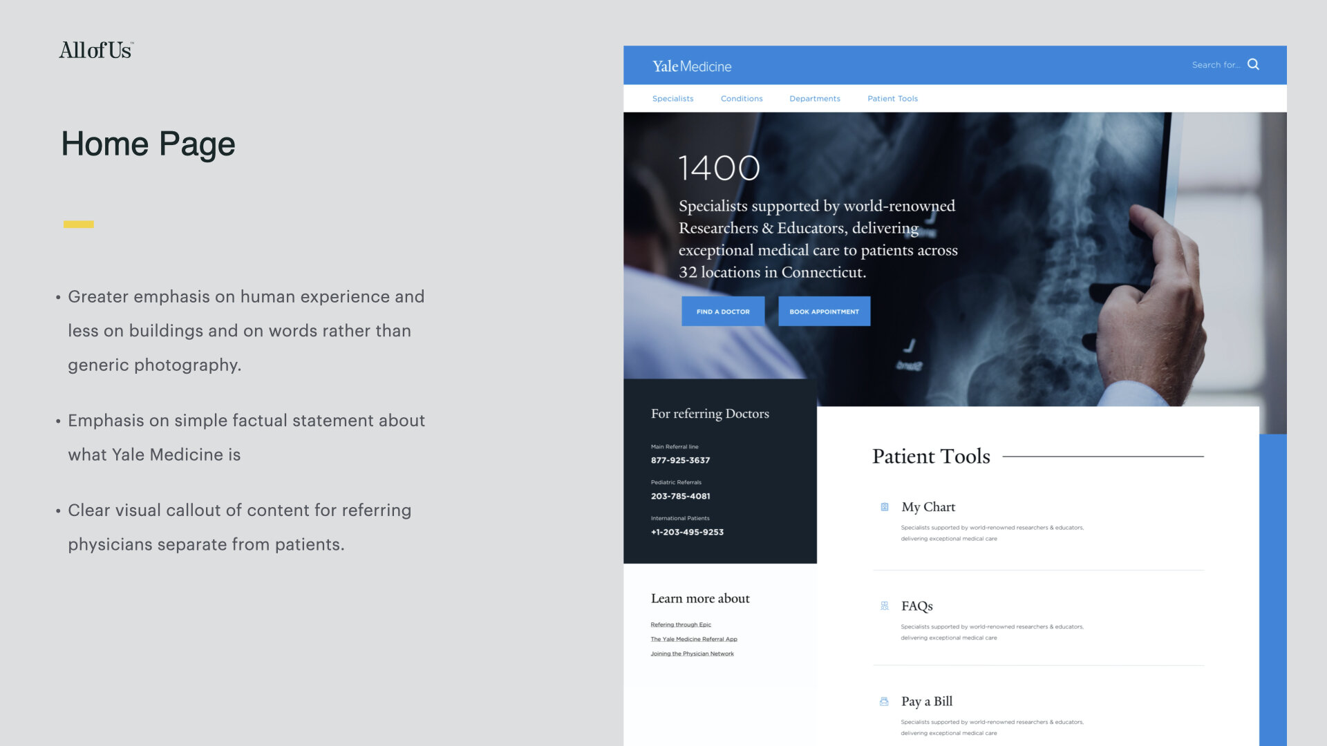
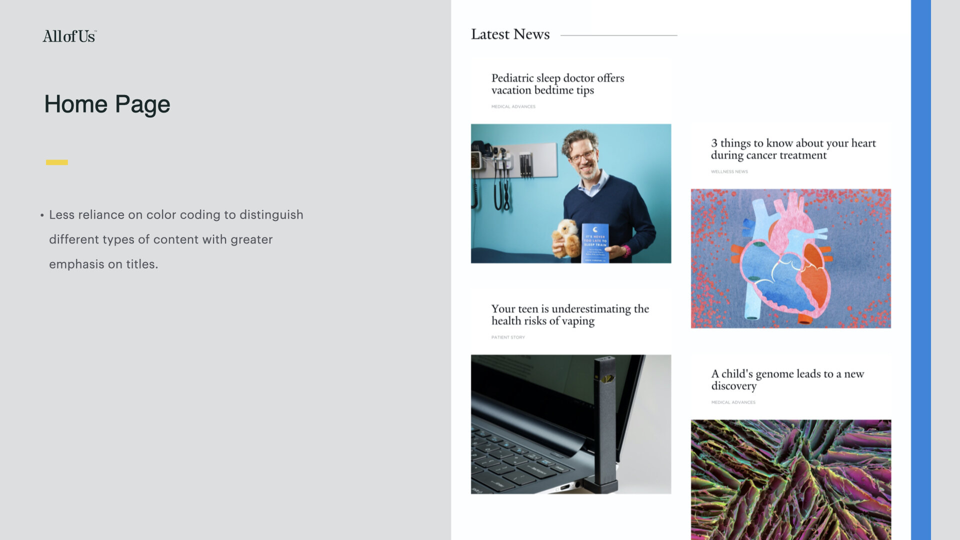
Design Proposal
First round of high fidelity designs
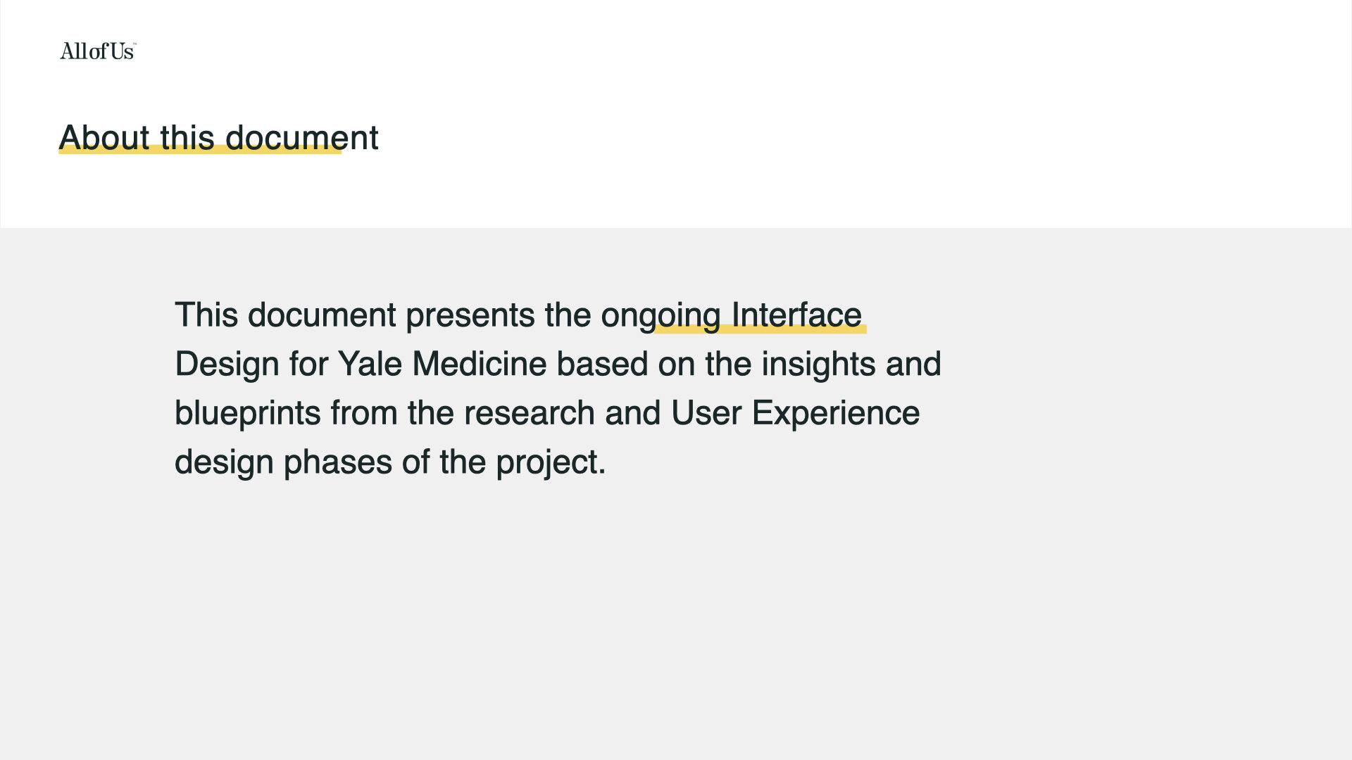
This presentation was based on the insights and iteration from the research and User Experience design phases of the project. This was the first major presentation we had with all stakeholders.
It demonstrates our:
Ambitions
Foundation
Design
Next Steps
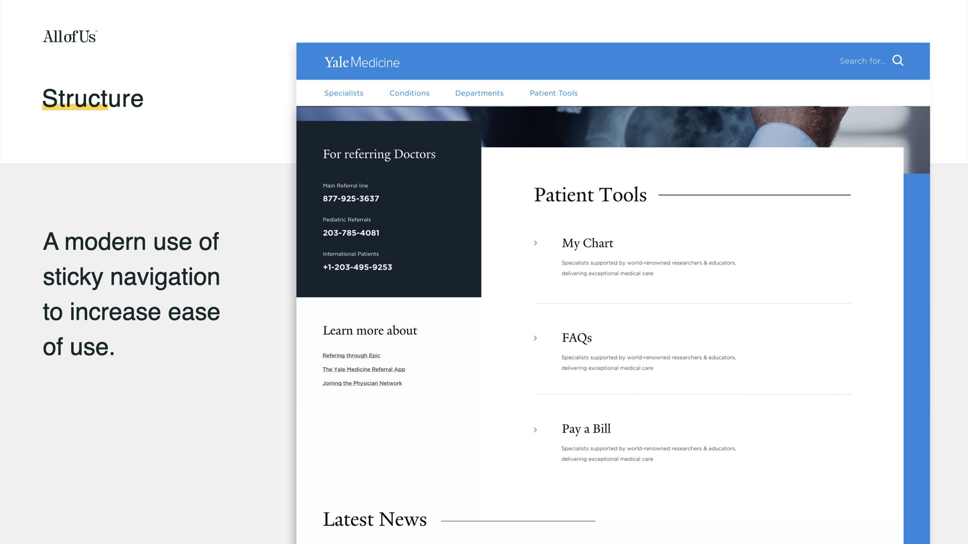


Design Kit
Meanwhile…
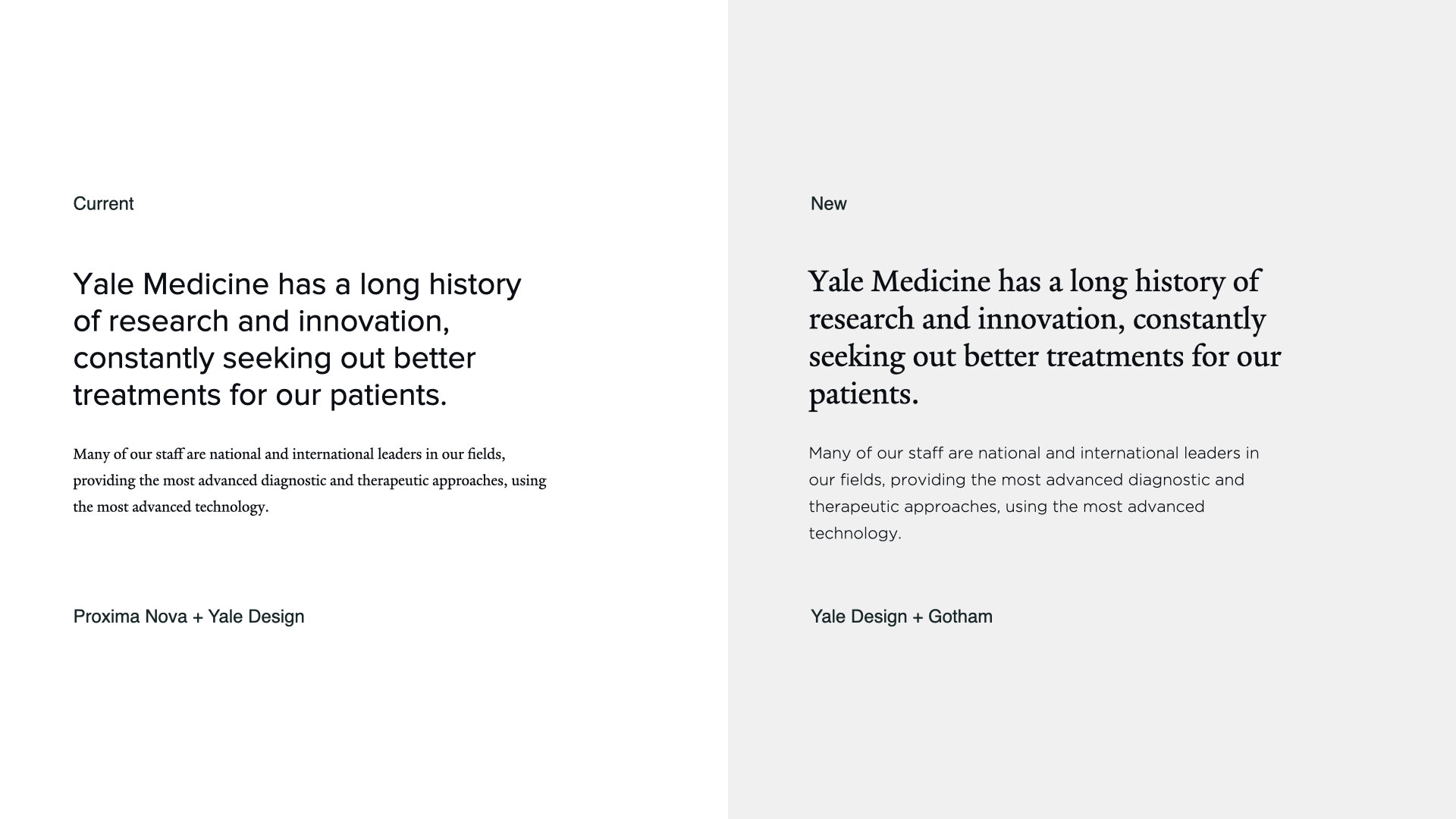
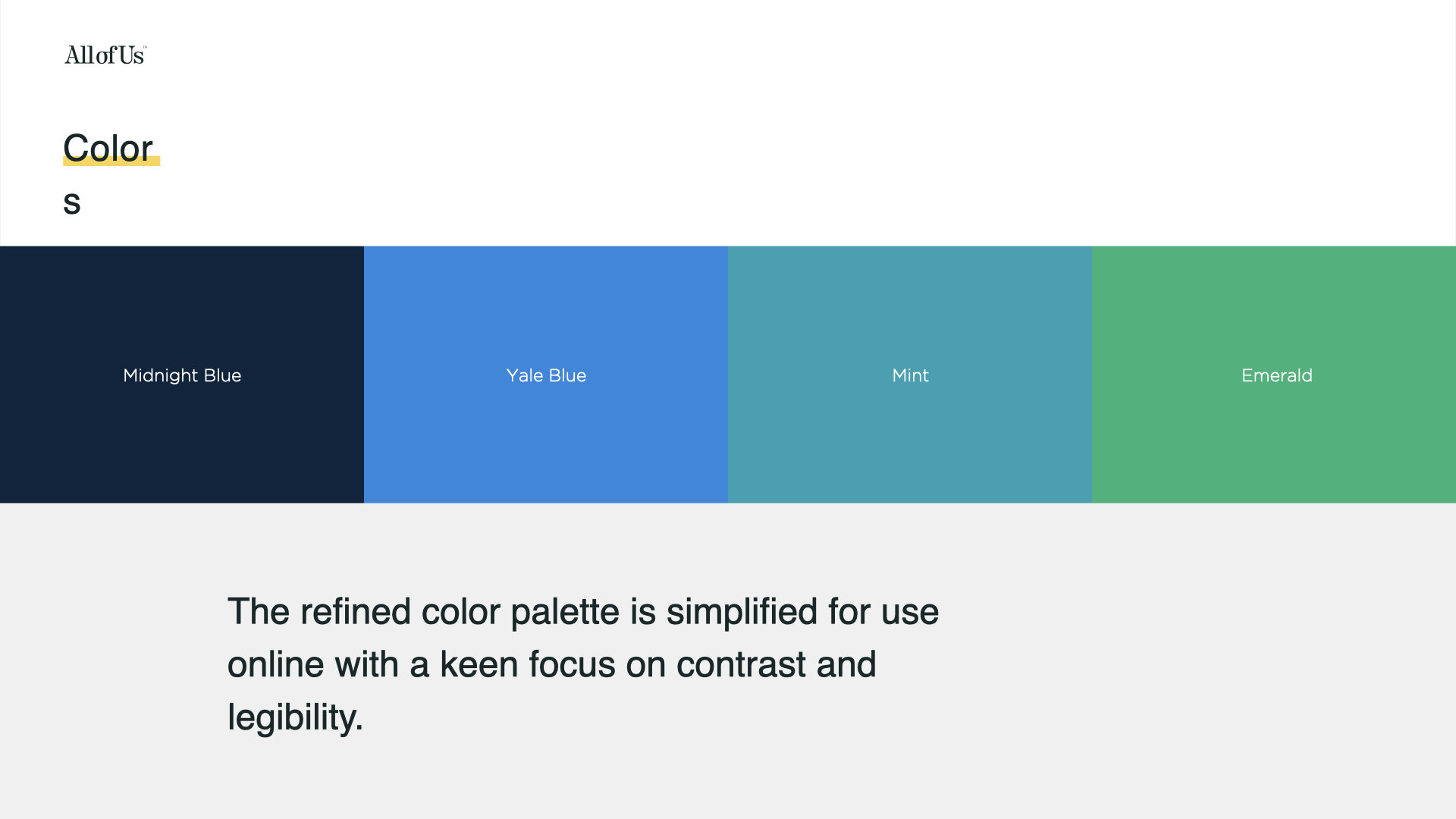
While the first wireframes were being reviewed & tested, I was tasked with creating a design kit. Their current website failed AA accessibility tests and it was very important that they passed, especially being a medical website. Yale has a very specific style & color scheme so, I tried to use their existing visual design elements as best as I could while making necessary changes in order to pass accessibility tests.

Check it out in detail on Invision here:
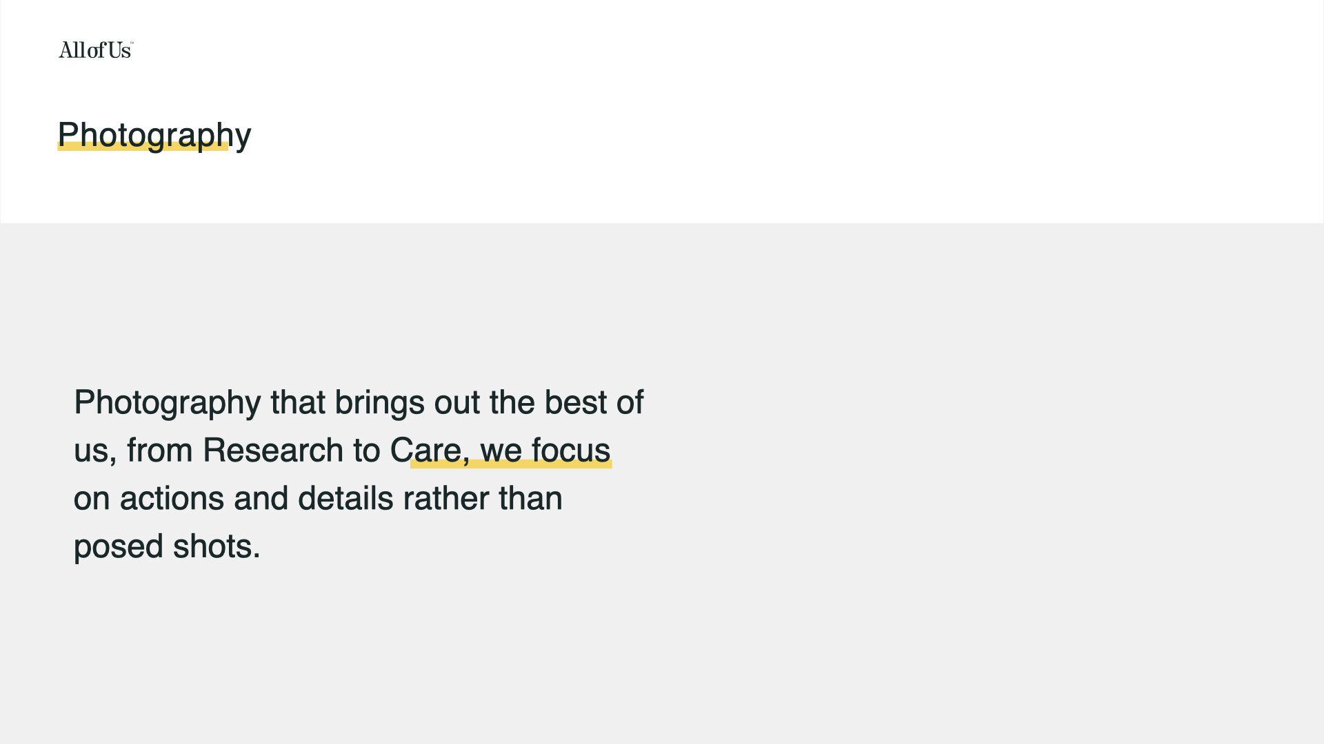
Illustrations
How can we attract the page skimmer?
The client wanted the site to feel more trustworthy and inviting. So, I did some research and discovered many websites use iconography & illustrations to make their users feel safe. Simply put, an instruction manual with images is easier and faster to understand than a lengthy explanation. This is because illustrations have the benefit of being unambiguous and direct whereas people are skimmers and rarely attentive. Icons are universally recognizable symbols, thereby removing language barriers and facilitating understanding among a larger audience.

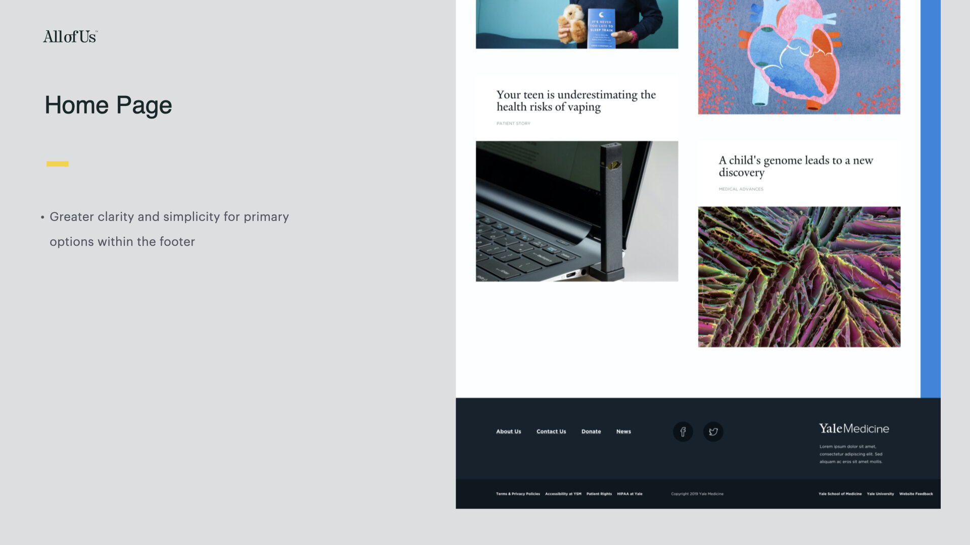
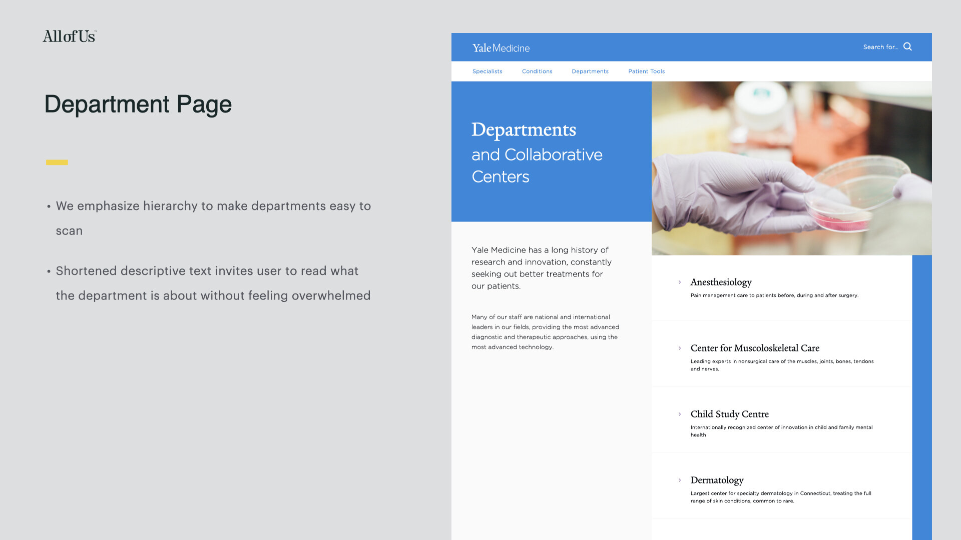
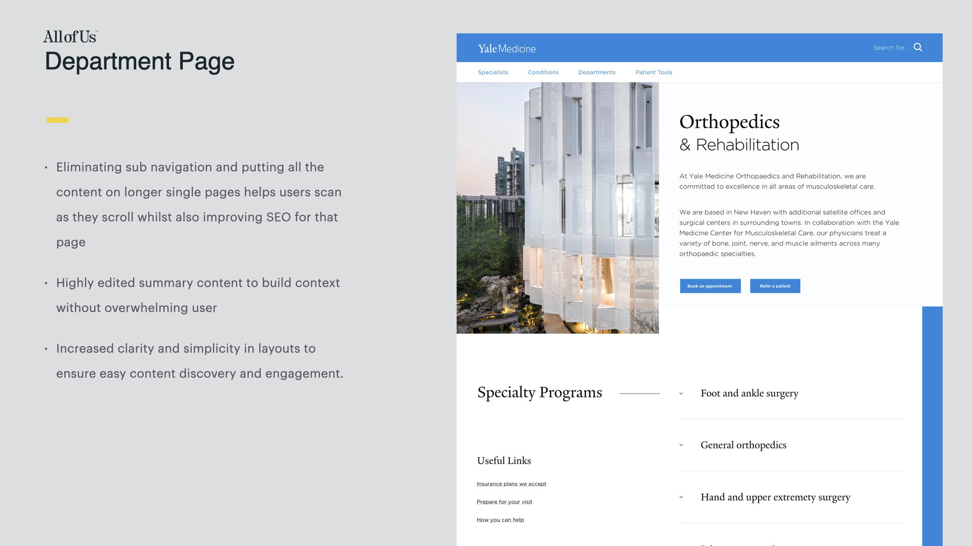
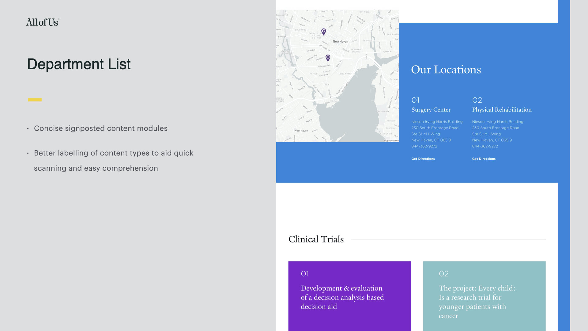
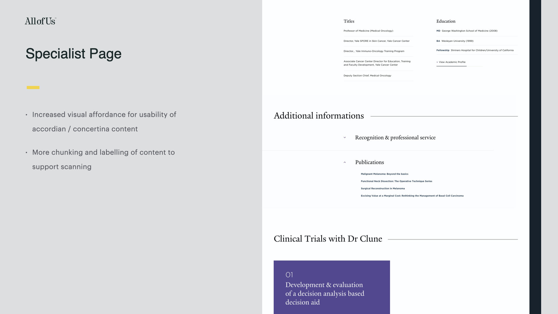
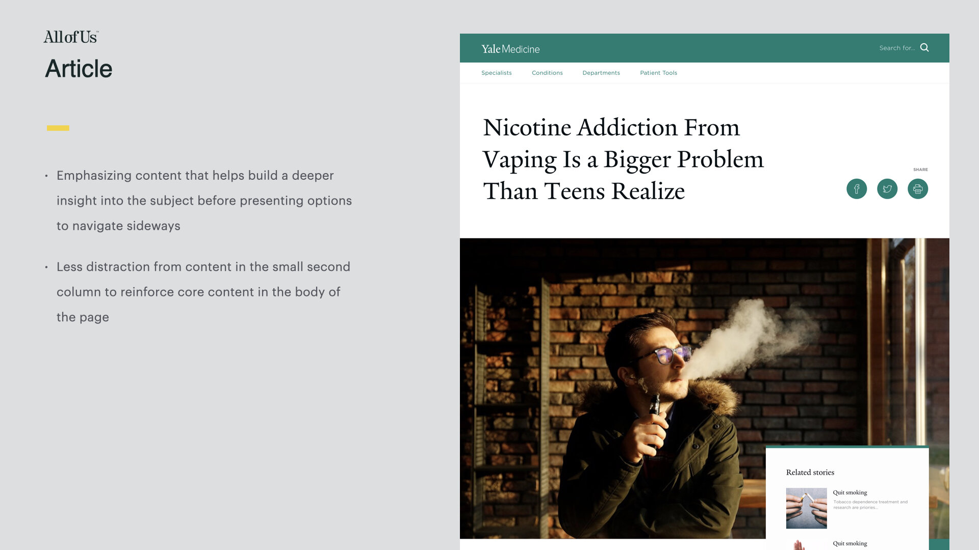
Final Design

Outcome
The design was well received within the company. While it has not yet been released, I have been working side by side with the engineering team, guiding them through any questions and helping them finesse the small details.
As a result of this experience, I learned how important it is to get as much feedback as possible at every stage and how important it is to communicate and work side by side with the engineering team.