Yale School of Medicine
Website redesign

overview
Yale School of Medicine is well known as a preeminent academic medical center that supports the highest quality education, research, and patient care, They take great pride in:
Educating and inspiring scholars and future leaders who will advance the practice of medicine and the biomedical sciences,
Advancing medical knowledge to sustain and improve health and to alleviate suffering caused by illness and disease, and
Providing outstanding care and service for patients in a compassionate and respectful manner.
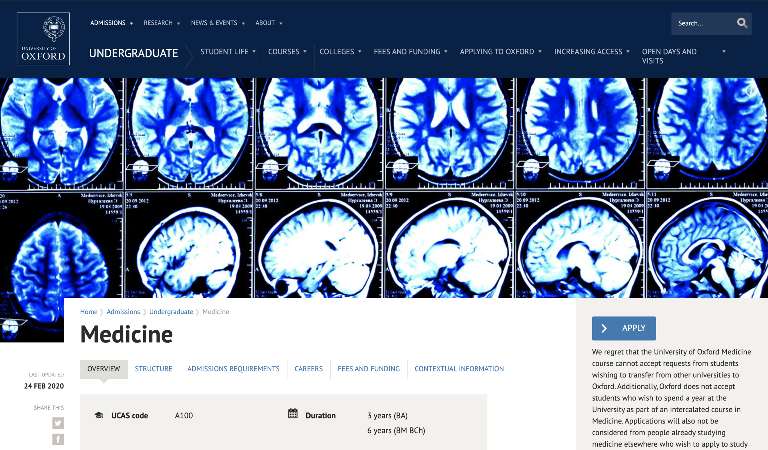
Challenge: Redesign Yale School of Medicine’s website across all platforms in order to create a better user experience for students, patients and specialists.
My Role
User flows, Heuristic Evaluation, Information Architecture, Sketching, Iconography, Wire-framing, UI, Prototyping, Lo/Hi Fidelity Designs, Usability Testing, Motion Graphics
Client
Yale University
Timeline
5 months
Our process
Agile design. Learn and grow together.
The stakeholders showed an interest in being with us step by step through the process. We introduced the agile design process to them, which meant we would be working and learning together from day one. Rather than coming up with an idea for the final creative from the start, we would refine ideas and craft the end product as we went. The goal was to have the client become part of the problem-solving team on the project.
With the client on the team, small decisions were made quickly and we were able to get faster feedback. The faster the feedback, allowed for us to quicken the process. We would communicate daily with the client and hold larger meetings with all the stakeholders 1-2 times a week.

Design Approach
User focused
To achieve the best results we suggest an approach with user research woven throughout. That will enable an iterative, collaborative, design process with the principal internal stakeholders as well as users.
User Research
Engage end users in the solution definition, design and testing to ensure maximum relevancy, usefulness and engagement
Activities
Survey’s
Video / In-person Interviews
Online feedback
Co-creation workshop
Prototyping (InVision)
Solution Definition
Evaluate performance against business objectives, user needs, best practice and key competitors. Define a new Experience Strategy and detailed end-to-end UX Improvements.
Output
Experience Strategy
Detailed UX documentation

Competitive Analysis
We looked at direct competitors (Medical Universities) websites to get a sense of recurring patterns.
Our summary of findings include:
Heavy content websites use photography and iconography to keep the user interested.
It is hard to read a menu bar with a lot of content or long titles.
The use of breadcrumbs are important when using websites that are three or more levels deep.
Bold and obvious CTA’s are important when they are placed within a lot of content.
Audit
Pinpointing which parts of the site were causing headaches.
It was now time for one of the most tedious tasks of the entire redesign process — one that was notorious for being very time-consuming.
Even though it was a very time consuming process, it allowed us to understand just how many pages there were on the original website and what needed to be deleted, merged or added. This was essential in helping us to see the big picture of our website’s problem, and it was from here that our redesign ideas started to take shape.

User Interviews
Let’s Meet The Users
We interviewed 10 students, 10 specialists and 10 patients/caregivers at Yale University. The users were all familiar with the website and used it quite often. We took video recordings of their computer screen (we purposefully used their computers to make them feel more comfortable) and asked our them to speak aloud as they were completing tasks. These were the 3 tasks they were asked to complete:
How do users learn about a specific educational program?
How do users navigate to patient givers? Do they understand that they are navigating to another website?
How to users find out about Yale School of Medicine news?
Afterward, we asked each user to use the website as they normally would on a day to day basis to see what the majority of the users were focussed on.
Test Results
Common findings.
Users generally used the main navigation instead of search. They would generally skip over the search as if they did not see it.
Users were often confused when they clicked on the patient givers tab. There was no sign indicating that it would take you out of the School of Medicine website. Users would immediately press the back button.
Users did not scroll down the home page to navigate to other sections of the website.
Users appeared frustrated when trying to read certain elements.
CTA’s are very inconsistent. The user often does not understand what and what isn’t clickable.
Page Level Feedback
What works and what doesn’t?
We took the users through each page to get a better understanding of how each element resonated. We used a grading system to show where users experienced positive reactions, mixed reactions and/or pain points.
User Work shop
Topic Mapping & Content Modeling
Before sketching wire frames, we wanted to categorize all the potential features and content on the website. So, we held multiple workshops with our stakeholders. These people included heads of departments, specialists and content editors. We put them into small groups and tasked them with cutting up, drawing & organizing given content and topics. This process was useful in:
Understanding what types of content you have
Analyzing how the content is made up
Defining how the content relates to each other
Understanding how users conceptualize & organize content

Information Architecture
Restructuring & Reorganizing
With the qualitative and quantitative data from the users, we were able to start reorganizing content. Once we had a better understanding of the content as a whole, it was clear how the IA would be structured.

Wireframes
Finding the easiest path for our users
Thanks to the results of the topic mapping & content modeling workshops, it was easy to organize and design the first round of wire frames. We found that users do NOT all think the same way but, they seemed to all use the same language. So, I was tasked with organizing and reassembling their ideas in a way that everyone could understand.
Iteration & Validation
The 1st workshop provided very useful feedback.
Throughout the 5 month project we held weekly meetings with our client so that we could show them our progress and get constant feedback. Until this point we had only been sharing pieces of the website with our client as to get feedback before we made too many design decisions.
This was the first time our client was actually able to click through wireframes to get a better understanding of how everything would work. e the In order to receive as much feedback as possible, we uploaded the wireframes to Invision and held a workshop teaching users how to leave helpful comments. The users were asked to perform the same tasks they were in the first round of user testing. This helped us validate that the new design was either working better or still needed improvements.
Design Kit
Staying focussed on accessibility.
While the first wireframes were being reviewed & tested, I was tasked with creating a design kit. Their current website failed AA accessibility tests and it was very important that they passed, especially being a medical website. Yale has a very specific style & color scheme but they wanted a new and fresh look. This proved to be very challenging. There was a lot of politics involved across many branches of the website and it took many rounds of design and iteration before a style was agreed on.

Check it out in detail on Invision here:
Photography Guidelines
Goals & Direction
Reduce anxiety around medical content with humanizing imagery
Focus on actions and details
Present our heritage alongside a modern look and feel


Motion graphics guideline
Creating seamless animations.
The client wanted the site to feel more trustworthy and inviting. So, I did some research and discovered many websites use iconography & illustrations to make their users feel safe. Simply put, an instruction manual with images is easier and faster to understand than a lengthy explanation. This is because illustrations have the benefit of being unambiguous and direct whereas people are skimmers and rarely attentive. Icons are universally recognizable symbols, thereby removing language barriers and facilitating understanding among a larger audience.


Final Design
Check out the full design in action here:
Outcome
The design was well received within the company and was released late 2019. I still work with the dev team when new features and pages are desired from Yale School of Medicine.
As a result of this experience, I learned that there are many benefits of an agile approach. Adopting an agile approach of looping clients into every phase of the process and producing a constant stream of deliverables allowed our clients to play around with designs as we went. It also allowed them to gain a better understanding of just how the realized vision will operate in a real world context. The more regular the communication, the lower the chances of surprises arising down the road, this allowed our team to adjust to changing demands along the way, rather than having our retrace our steps.